Crockpot: A picture paints a thousand words
Tim Farrelly | farrelly’s Investment Strategy | 08 December 2023
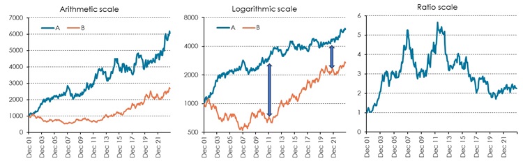
Yes, but is the story that the picture paint accurate? The three graphs below show three different ways of presenting an identical set of statistics. We could be comparing two asset classes or the performance of a manager against their chosen index. The first, the arithmetic scale, is the most common and the easiest to understand. It can also be the most deceptive.
Figure 1: Identical sets of data
Source: farrelly’s
The arithmetic scale chart shows a large and apparently consistent outperformance by Asset A which is seemingly a clear winner over Asset B over vi...


